You invested thousands of dollars to rank on Google.
And it worked.
You rank higher than your competition for several top keywords.
Your organic search traffic is zooming out of orbit.
You are in lead conversion heaven.
Until now…
You made one tiny mistake.
The Flaw in your Plan
While you spent countless hours and thousands of dollars perfecting the look and feel of your website and its content, you neglected its mobile version.
It is now biting at your ankle through Google’s mobile-first index.
 Wait! You may be thinking…
“My site is already mobile optimized. I’m all set, right?”
Not anymore.
Is your content optimized for the new realities of search?
Are the internal links working on your mobile site?
How fast does your page load on a smartphone?
These may not have been serious concerns till a few months ago, but with Google set to change its website indexing from desktop-based to a mobile-based system over the next several months, these parameters are now paramount not only for your company’s growth, but maybe even its survival.
What is Google mobile-first index?
Until recently, Google was viewing web pages from a desktop user’s point of view. But it will now crawl the web as a mobile user, treating mobile versions of each page as the primary page to index.
Herein lies the difference.
Google will now rank and display search results based on the mobile version of the content, even when you are searching on a desktop.
So, if your site lacks mobile responsiveness or part of your content is invisible on the mobile version, or pages take ages to load, your search visibility and lead generation will land in serious trouble.
The Silver Lining
The good news?
If you bring in a certified marketing consultant now and get your site mobile-optimized, you can stop Google’s mobile-first index from destroying your search rankings – and severely damaging your business.
There are 4 essentials needed to build an awesome mobile-friendly website.
1. Content
Many websites show specific content to desktop visitors, but hide it for mobile users. Maybe because it’s difficult to place that content within the mobile version’s design and it’s just easier to avoid showing it altogether!
With Google now primarily searching mobile versions for content, omitting it from mobile sites is a sure-fire way of killing your search visibility.
Make sure all your content is visible to users irrespective of the device they use.
Use ‘read more’ buttons or expandable content structure for long-form posts. This creates better user experience on mobile devices with limited screen space.
Also, incorporate other types of content like video or audio that are more easily consumable than long form text on mobile devices.
2. Page Speed
 The speed at which your site loads has always been an important Google ranking factor.
Smaller pages load faster. For a mobile user not on Wi-Fi, spotty internet connections make it tough to load even moderately heavy pages, talk about content heavy sites.
Images and custom fonts are the two usual culprits weighing pages down. Resize images and remove custom fonts to slim down your site.
To check if your page speed needs action, test your site with Google’s PageSpeed Insights Tool.
3. Internal Links
If you use a different URL for your mobile site (m.example.com) or use dynamic serving – where certain content is hidden depending on the device – internal links on your mobile site could differ from the desktop version.
This can cause user experience to fall as they struggle to locate content that was easily discoverable on the desktop version.
Internal links help Google index your site better – if more people easily find useful content on your site, Google will rank you higher.
Make sure your internal links remain the same across devices.
4. Structured Data
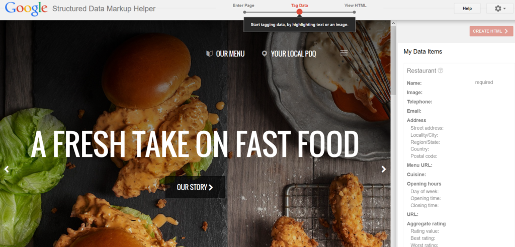
 Structured data tells search engines what a page is about, and the different elements it contains, so that they can return more useful results to searches.
Structured data is often removed from a site’s mobile version. Since Google will now look at your mobile site for structured data, you will completely disappear from search results if it’s absent.
Use Google’s Structured Data Testing Tool on your mobile and desktop site to ensure it is same across both devices.
Make the Transition
Remaining compliant with Google’s mobile-first index is a complicated job. But if you don’t want your organic lead generation to get wiped out, you can’t ignore it.
The simplest way to keep ranking on Google is to hire a certified marketing consultant who is familiar with the technicalities of how to keep your mobile visitors happy.
Do it now, before your competitors take over your search rankings.
What’s Next?
No Obligation, Cancel at Anytime, Value-Driven Onboarding
It’s as easy as 1,2,3, and 4. We want to earn your business by establishing trust and value. As a result we have created a simple, low-cost onboarding process to ensure you are satisfied every step of the way.
No huge setup cost or expensive onboarding required.
SIMPLE AS 1,2,3,4
| 1 | 15 Minute Exploratory Meeting ($0 cost) (learn more) |
| 2 | 60 Minute Deep Dive Consult ($99 regularly $250) (learn more) |
| 3 | 5 Hour Design & Consulting Services ($750) (learn more) |
| 4 | Full Service Consulting Services ($2500+ pm) (learn more) |

