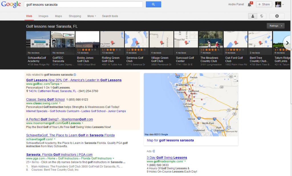
It looks like Google’s making significant adjustments to their local search engine layout freeing up some real estate where the local elements used to be, above the organic search listings.
Google’s Latest Local Search Layout displays pictures of local elements, either photos uploaded by user or the map icon. In addition there is now right and left scroll arrows to browse the local listings separate from the page itself.
Google’s Latest Local Search Layout is also highlighting the reviews and star ratings and detunes the focus on the specific address.
What do you think of the change?


